- EasyCard
- Trade
- Help
- Announcement
- Academy
- SWIFT Code
- Iban Number
- Referral
- Customer Service
- Blog
- Creator
A Comprehensive Guide to the Fed's Dot Plot and Its Investment Applications


Image Source: pexels
The Fed dot plot illustrates the Federal Open Market Committee (FOMC) members’ projections for future interest rates. Every quarter, 19 members submit their interest rate expectations. The table below summarizes the relevant information:
| Frequency | Number of Participants |
|---|---|
| Published Quarterly | 19 FOMC Members |
Investors closely monitor the dot plot as it can influence market trends. According to BMO Capital Markets, U.S. stocks have an 80% probability of positive returns in the 12 months following the Fed’s first rate cut, with an average gain of nearly 11%. This tool helps market participants better gauge interest rate directions, thereby optimizing investment decisions.
Key Points
- The Fed dot plot displays FOMC members’ projections for future interest rates, and investors should monitor its changes to optimize investment decisions.
- The dispersion of the dot plot reflects the consensus among policymakers; greater divergence increases market uncertainty, requiring cautious responses from investors.
- By combining the dot plot with economic data such as inflation and employment, investors can more comprehensively assess market trends, improving decision quality.
- The dot plot is only a forecasting tool with limited historical accuracy, and investors should avoid treating it as a commitment to future policy.
- Scientific risk management strategies include diversified investments and dynamic asset allocation adjustments to address market changes.
Introduction to the Fed Dot Plot

Image Source: pexels
Definition and Role
The Fed dot plot is a graphical tool used to display the Federal Open Market Committee members’ projections for future interest rates. Each member submits their interest rate expectations during meetings, and the dot plot presents these projections as dots. Market participants can observe these dots to understand policymakers’ views on the economic outlook. The dot plot plays a significant role in monetary policy communication. Some experts believe the dot plot helps the market understand policy directions. Brian Sack argues that the market can interpret these dots without viewing them as commitments. Critics like Christina Romer suggest that the dot plot may lead to misunderstandings. McMahon proposes linking the dots to each member’s economic projections to better convey uncertainty. The table below summarizes different perspectives:
| Perspective | Argument |
|---|---|
| Supporters | Brian Sack believes the dot plot is an effective communication tool, and the market understands the dots without treating them as commitments. |
| Critics | Christina Romer states that the dot plot may cause misunderstandings and suggests discontinuing it. |
| Improvement Suggestions | McMahon recommends linking the dots to each FOMC member’s economic projections to better convey uncertainty. |
Release Frequency
The Fed dot plot is released four times a year, typically alongside the Summary of Economic Projections. Each release corresponds to a significant policy meeting. Investors can adjust their investment strategies based on these scheduled releases. Below is the official release schedule for the coming years:
| Meeting Dates | Notes |
|---|---|
| March 17-18, 2026 | Meeting associated with the Summary of Economic Projections |
| June 16-17, 2026 | Meeting associated with the Summary of Economic Projections |
| September 15-16, 2026 | Meeting associated with the Summary of Economic Projections |
| December 8-9, 2026 | Meeting associated with the Summary of Economic Projections |
Market Impact
The Fed dot plot has a significant impact on U.S. markets. Investors adjust asset allocations based on the interest rate projections in the dot plot. The dot plot shows whether members have consensus or divergence on future rates, and the market uses this to gauge monetary policy directions. If most members predict rising rates, the market may expect higher funding costs, putting pressure on asset prices. Conversely, if the dot plot signals rate cut expectations, the market typically reacts positively. The dot plot affects not only the stock market but also bonds and forex markets. By analyzing the dot plot, investors can better seize investment opportunities arising from Fed policy changes.
Structure and Interpretation
Structural Elements
The Fed dot plot has a clear structure, making it easy for investors to quickly grasp key information. The chart typically uses a grid format with axes. The vertical axis represents interest rate percentages, while the horizontal axis represents time, starting from the current year, with the final column labeled “longer run.” Each column corresponds to a year, reflecting policymakers’ expectations for interest rates in future years. The table below summarizes the main structural elements of the dot plot:
| Structural Element | Description |
|---|---|
| Columns | Each column represents a year, starting from the current year, with the final column marked as “longer run.” |
| Rows | Rows represent interest rate percentages. |
| Dots | Dots represent each member’s interest rate projection for a specific year. |
By observing these structures, investors can intuitively understand policymakers’ overall judgments on future interest rates.
Meaning of the Dots
Each dot in the Fed dot plot carries specific meaning.
- Each dot represents a Federal Reserve official’s projection for the federal funds rate at a specific future point.
- If an official expects the year-end target range to be 4.25–4.50%, the dot will be placed between these values.
The distribution of dots also conveys important information. When multiple dots cluster at a certain rate level, it indicates consensus among most members. Scattered dots reflect divergence among members, potentially leading to higher market uncertainty.
Interpretation Methods
When interpreting the Fed dot plot, investors should focus on the following aspects:
- Degree of dot dispersion: Widely spaced dots indicate significant disagreement among policymakers, suggesting higher uncertainty in future policy directions. Clustered dots suggest consensus, making market expectations clearer.
- Do not view dots as commitments: Fed leaders have repeatedly emphasized that the dot plot reflects current projections, not policy commitments. Investors should approach it rationally and avoid misinterpretation.
- Focus on the median dot: The median dot reflects the central tendency of policymakers, serving as a key reference for future rate expectations. A rising median suggests continued tightening, while a declining median may indicate easing.
- Emphasize longer-run projections: The longer-run column shows members’ judgments on the economy’s long-term equilibrium rate. Investors can adjust asset allocation strategies based on these projections.
Tip: When analyzing the dot plot, investors should combine it with macroeconomic data like inflation and employment for a more comprehensive judgment.
By systematically interpreting the dot plot’s structure, dot distribution, and median, investors can scientifically grasp Fed policy signals, providing strong support for asset allocation and risk management.
Market Impact
Interest Rate Expectations
Market participants closely monitor changes in the Fed dot plot. After each release, investors adjust their views on future rates based on policymakers’ collective expectations. When the dot plot shows divergence among members, market volatility typically increases. The table below summarizes the impact of dot plot changes on rate expectations:
| Evidence Point | Description |
|---|---|
| Changes in the Fed Dot Plot | Reflects policymakers’ collective expectations for future rates, influencing market views on future rates. |
| Divergent Dot Plot | Indicates uncertainty about the timing and extent of rate cuts, potentially leading to market fluctuations. |
| Market Reaction | After the Fed pauses rate hikes, long-term yields stabilize, and the market expects rates to remain high. |
By analyzing the dot plot, investors can gauge future rate trends and adjust asset allocation strategies proactively.
Asset Prices
Interest rate expectations directly impact asset prices in the U.S. market. When the dot plot signals rate cut expectations, the stock market typically rises. If the dot plot reflects concerns about inflation, stock prices may decline. The bond market is also affected, with long-term yield changes reflecting investors’ judgments on future rates. The Fed’s cautious stance keeps the market vigilant, amplifying asset price volatility.
Tip: When analyzing asset prices, investors should combine the dot plot with macroeconomic data like inflation and employment for a more comprehensive judgment.
Case Study
After one Fed meeting, the FOMC members’ projections for future rate ranges were distributed as follows:
| Number of FOMC Participants | Projected Rate Range |
|---|---|
| 7 | 4.25%-4.50% |
| 8 | 3.75%-4.00% |
| 2 | 4.00%-4.25% |
| 2 | 3.50%-3.75% |
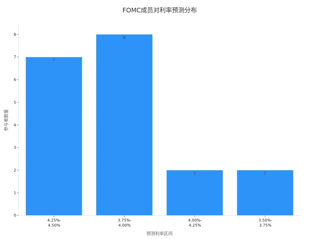
The chart shows significant divergence among members, indicating market uncertainty about future rate trends. The stock market initially rose after the Fed paused rate hikes but later declined due to inflation concerns. Investors need to closely monitor the gap between the dot plot and actual policy decisions, adjusting strategies promptly.
Limitations
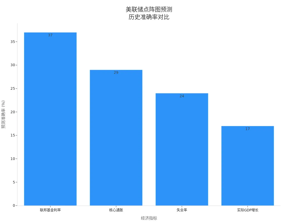
Prediction Accuracy
As a forecasting tool, the Fed dot plot has limited accuracy. Historical data shows that FOMC members’ projections for the federal funds rate have an accuracy rate of only 37%. Core inflation projections have a 29% accuracy rate, unemployment 24%, and real GDP growth only 17%. These figures indicate that the dot plot reflects members’ current views, not future outcomes. The complexity of economic conditions and external shocks, such as pandemics or financial crises, often lead to significant deviations between actual rates and projections.
| Economic Indicator | Accuracy Rate |
|---|---|
| Federal Funds Rate | 37% |
| Core Inflation | 29% |
| Unemployment Rate | 24% |
| Real GDP Growth | 17% |
Divergence of Opinions
The dot plot reflects individual FOMC members’ projections, and divergence is common. The complexity of the economy and data lags cause members to have differing views on future rates. Economic condition changes, external events, and market expectations all influence members’ judgments. The table below shows that divergence was highest in 2020, moderate in 2021, and lower in 2022. Greater dot dispersion indicates less consensus among members, increasing market uncertainty.
| Economic Period | Degree of Divergence |
|---|---|
| 2020 | High |
| 2021 | Moderate |
| 2022 | Low |
- Economic complexity increases forecasting difficulty
- External shocks like pandemics affect actual rates
- Data lags impact members’ judgments
- Market reactions may inversely influence FOMC decisions
Risk of Misinterpretation
Investors can easily misinterpret the dot plot. Some observers view it as a signal of the Fed’s future rate path, ignoring that it is only a projection, not a commitment. The median dot is often seen as a strong indicator of Fed plans, but the Fed chair has repeatedly cautioned against over-interpretation. Misreading the dot plot can lead to investment decision errors, increasing asset allocation risks.
Tip: Investors should combine other economic data and policy statements, rationally analyzing the dot plot to avoid decisions based solely on it.
- The dot plot may be mistaken for a policy commitment
- The median dot is prone to over-interpretation
- Misinterpretation risks increase investment uncertainty
Investment Decisions

Image Source: pexels
Information Integration
When analyzing the Fed dot plot, investors should not rely on a single data point. Many professionals combine the dot plot with inflation reports, unemployment data, and corporate earnings for analysis. This multidimensional approach helps better grasp macroeconomic trends, particularly for assets sensitive to economic changes, such as gold, interest rates, and tech stocks.
Investors are advised to regularly monitor key U.S. economic data, using the dot plot as a critical piece of the macroeconomic puzzle to enhance investment judgment accuracy.
Practical Recommendations
In complex market environments, professional investors typically adopt diversified and resilience-focused strategies.
- Diversify investment regions, especially when multiple developed economies cut rates, seeking opportunities in different markets.
- In the U.S. market, with unclear inflation prospects, investors can prioritize short-term Treasuries and high-quality corporate bonds, which offer favorable risk-adjusted returns.
- In asset allocation, adjust the proportions of stocks, bonds, and cash flexibly based on personal risk tolerance.
Risk Management
Scientific risk management is the core of investment decisions. Investors can adopt the following methods to reduce risks:
- Diversification: Spread investments across different asset classes, industries, and regions to reduce the impact of single-asset volatility.
- Asset Allocation: Allocate stocks, bonds, and cash reasonably based on personal goals and risk tolerance.
- Inflation Hedging: Appropriately allocate to inflation-linked bonds and real estate to protect investment value.
- Interest Rate Risk Management: Reduce the impact of rate fluctuations by diversifying bond maturities.
- Liquidity Management: Ensure some assets can be readily liquidated to meet unexpected cash needs.
- Portfolio Insurance: Set a minimum value to prevent significant losses.
- Market Analysis: Use tools like the U.S. Treasury yield curve and VIX index to dynamically adjust risk and return expectations.
Investors should continuously learn and update investment models, combining the Fed dot plot with multiple economic indicators to manage investment risks scientifically.
The Fed dot plot provides a reference for interest rate expectations. Investors should rationally analyze the dot plot, combining it with inflation, employment, and other economic data. Scientific information integration enhances decision quality. The dot plot has prediction errors and divergence, so investors must beware of misinterpretation risks. Dynamically adjusting investment strategies enables better responses to market changes.
FAQ
What Is the Relationship Between the Fed Dot Plot and Rate Decisions?
The dot plot reflects FOMC members’ projections for future rates. Actual rate decisions are made at Fed meetings, and the dot plot serves only as a market reference.
How Can Investors Combine the Dot Plot with Other Economic Data for Analysis?
Investors can analyze the dot plot alongside inflation, employment, and other data. This helps comprehensively assess U.S. market trends and optimize asset allocation.
How Does the Market React When the Dot Plot Shows Divergence?
When members’ projections diverge, market volatility typically increases. Investors should focus on the median and longer-run projections, adjusting strategies rationally.
How Do Hong Kong Licensed Banks Use the Dot Plot to Adjust USD Asset Allocation?
Hong Kong licensed banks refer to dot plot projections, combining their risk management models to dynamically adjust USD asset proportions, enhancing portfolio stability.
Can the Dot Plot Accurately Predict Future Rates?
The dot plot reflects only current views. Historical data shows limited prediction accuracy, and investors should beware of misinterpretation risks, combining multiple information sources for decisions.
You now know how to interpret the Fed’s Dot Plot and understand the importance of integrating rate forecasts with macroeconomic data. In a fast-moving market, the key to achieving your investment goals lies in your ability to convert that analysis into actual asset allocation both efficiently and affordably.
Whether you’re adjusting US stock positions based on the Dot Plot signal or optimizing your bond holdings, traditional cross-border payment and exchange methods often incur high costs and time delays. This can not only reduce your potential returns but also cause you to miss optimal entry points.
BiyaPay is dedicated to providing you with a seamless, low-cost global financial management experience. We offer real-time exchange rate inquiry and conversion for fiat currencies, with remittance fees as low as 0.5%. Plus, our zero commission for contract limit orders significantly cuts your trading expenses. BiyaPay supports the conversion between various fiat and cryptocurrencies, allowing you to participate in global asset allocation, including Stocks, all within one platform. There is no need for a complex overseas account, and you can enjoy same-day remittance and arrival. Click the Real-time Exchange Rate Inquiry now, BiyaPay for quick registration, and execute your investment decisions as precisely and efficiently as your analysis.
*This article is provided for general information purposes and does not constitute legal, tax or other professional advice from BiyaPay or its subsidiaries and its affiliates, and it is not intended as a substitute for obtaining advice from a financial advisor or any other professional.
We make no representations, warranties or warranties, express or implied, as to the accuracy, completeness or timeliness of the contents of this publication.


Contact Us
Company and Team
BiyaPay Products
Customer Services


BIYA GLOBAL LLC is a licensed entity registered with the U.S. Securities and Exchange Commission (SEC No.: 802-127417); a certified member of the Financial Industry Regulatory Authority (FINRA) (Central Registration Depository CRD No.: 325027); regulated by the Financial Industry Regulatory Authority (FINRA) and the U.S. Securities and Exchange Commission (SEC).
BIYA GLOBAL LLC is registered with the Financial Crimes Enforcement Network (FinCEN), an agency under the U.S. Department of the Treasury, as a Money Services Business (MSB), with registration number 31000218637349, and regulated by the Financial Crimes Enforcement Network (FinCEN).
BIYA GLOBAL LIMITED is a registered Financial Service Provider (FSP) in New Zealand, with registration number FSP1007221, and is also a registered member of the Financial Services Complaints Limited (FSCL), an independent dispute resolution scheme in New Zealand.