- EasyCard
- Trade
- Help
- Announcement
- Academy
- SWIFT Code
- Iban Number
- Referral
- Customer Service
- Blog
- Creator
Stock Heat Maps: A Visual Guide to Understanding Stock Market Trends


What is a stock heat map?
A stock heat map is a two-dimensional, color-coded visualization of stock market data, primarily used to represent the performance of a set of stocks, often grouped by sector or market index. The color intensity signifies the magnitude of a chosen metric, typically price change: green hues indicate gains, while red hues denote losses. Darker shades usually represent more significant price movements.
As a visual tool, stock market map enables traders and investors in the United States to quickly grasp the overall market sentiment and identify prevailing trends at a glance. For instance, a heat map of the S&P 500 might show a sea of green if the majority of stocks are trading positively, or vice versa. According to MarketBeat data from August 2022 (MarketBeat, 2023), the combined market capitalization of all S&P 500 companies exceeded $36 trillion, highlighting the vastness of the market such tools help navigate.

Key features of a stock heat map include:
- Color coding: As mentioned, colors like green and red, with varying intensities, represent the direction and magnitude of stock price changes or other metrics like trading volume. For example, a bright green for Apple Inc. (AAPL) on a TradingView heatmap might indicate a significant positive percentage change for the day.
- Sector grouping: Stocks are often organized into their respective sectors (e.g., Technology, Healthcare, Financials). This allows for a quick assessment of sector-wide performance. If most technology stocks on a sector-based heat map are showing green, it suggests strength in that sector.
- Time-based performance tracking: Heat maps can display performance over various timeframes, from intraday (e.g., 1-hour, 4-hour) to longer periods (e.g., daily, weekly, monthly, year-to-date). This allows investors to analyze both short-term and long-term trends. Many platforms, like Barchart, offer heat maps with customizable timeframes, showing percentage changes over periods like “Today,” “5-Day,” or “Year-to-Date.”
Beyond price performance, some heat maps allow users to visualize other crucial data points, such as market capitalization (the size of the colored block often corresponds to a company’s market cap, as seen on FINVIZ), trading volume (intensity of color might reflect higher or lower than average volume), Price-to-Earnings (P/E) ratio, and dividend yield, offering a more comprehensive view for investment analysis.
How do stock market heat maps work?
Stock market heat maps function by translating complex financial data into an intuitive visual format using color and size variations. At their core, they employ a color-coding system to represent the direction of stock price movements. Typically, green shades signify positive price changes (gains), while red shades indicate negative price changes (losses). The intensity of these colors often corresponds to the magnitude of the price change, as darker greens suggest larger gains, and darker reds indicate more significant losses.
Beyond just price directions, heat maps often use other visual cues to represent additional data points:
- Size: The size of each rectangular block representing a stock can be proportional to its market capitalization. Larger blocks visually correspond to companies with larger market caps, providing an immediate sense of the relative importance of different stocks within the displayed set. For instance, on a heat map of the Dow Jones Industrial Average, the block representing Apple (AAPL) would likely be larger than a company with a smaller market capitalization. As of May 2024, Apple’s market capitalization hovered around $3 trillion (Times of India, 2024), making its visual representation significant on many heat maps tracking major US equities.
- Color intensity: As mentioned earlier, the intensity of the green or red color usually reflects the percentage change in price over a specific period. A stock that has gained 5% might be represented by a brighter green than one that has gained 1%. Similarly, a stock down 3% might show a less intense red than one that has fallen by 10%.
By employing these visual elements, stock market heat maps condense vast quantities of real-time or historical market data into a readily understandable format. Instead of sifting through numerous rows and columns of numbers, traders and investors in the U.S. can quickly identify which sectors are performing strongly or weakly, which individual stocks are experiencing significant price movements or high trading volume, and the overall market sentiment at a glance. This visual aggregation of data allows for faster and more efficient analysis of market trends and potential investment opportunities.
Types of stock heat maps
Stock market heat maps come in several variations, each designed to provide a specific lens on market performance. The following are the major types that you should know about.

- Overall market heat maps: These heat maps offer a broad view of the entire stock market or a major index like the S&P 500, the Nasdaq Composite, or the Dow Jones Industrial Average. Each block typically represents an individual stock within that index, colored according to its price performance for the chosen period.
- Sector heat maps: These heat maps segment the market into different sectors, such as technology, healthcare, financials, energy, and consumer discretionary. Each block then represents a stock within that specific sector. This allows investors to quickly identify which sectors are leading or lagging.
- Live stock heat maps: Stock market heat map live are real-time or intraday heat maps that continuously update throughout the trading day. The colors and intensities of the blocks fluctuate as stock prices change, providing a dynamic view of the market’s immediate movements. These are particularly valuable for day traders and active investors in the U.S. who need to monitor short-term price action and identify fleeting opportunities.
- Customizable heat maps: Recognizing that investors have diverse strategies and interests, many platforms offer customizable heat maps. These allow users to focus on a specific subset of stocks (e.g., their watchlist), a particular index (e.g., the Russell 2000 for small-cap U.S. companies), or even stocks within specific geographic regions. Customization extends to the metrics displayed, allowing users to color-code based on price change, volume, market cap, or other indicators relevant to their analysis.
Benefits of using stock heat maps
Leveraging stock heat maps offers several compelling advantages for investors navigating the U.S. equity market, such as the ones mentioned below:
- Quick visual insights: Stock heat maps excel at providing immediate visual summaries of market performance. Within seconds, investors can discern the strongest and weakest sectors or individual stocks. This rapid visual assessment saves significant time compared to manually reviewing lists of stock prices or sector performance data.
- Identifying trends: Heat maps are invaluable for spotting emerging market trends and instances of sector rotation. Consistent patterns of color changes over time on sector heat maps can indicate a shift in market focus. Monitoring these visual cues can help investors align their strategies with prevailing market dynamics.
- Time-saving: By presenting a consolidated visual representation of vast amounts of market data, heat maps significantly reduce the time required for initial market analysis. This efficiency allows for faster decision-making and more agile portfolio adjustments.
- Diversification: Heat maps can be a useful tool for assessing and managing portfolio diversification. By clearly highlighting underperforming and outperforming sectors, they can prompt investors to consider whether their holdings are appropriately balanced across different segments of the economy. This visual feedback aids in making more informed diversification decisions aligned with overall market trends.
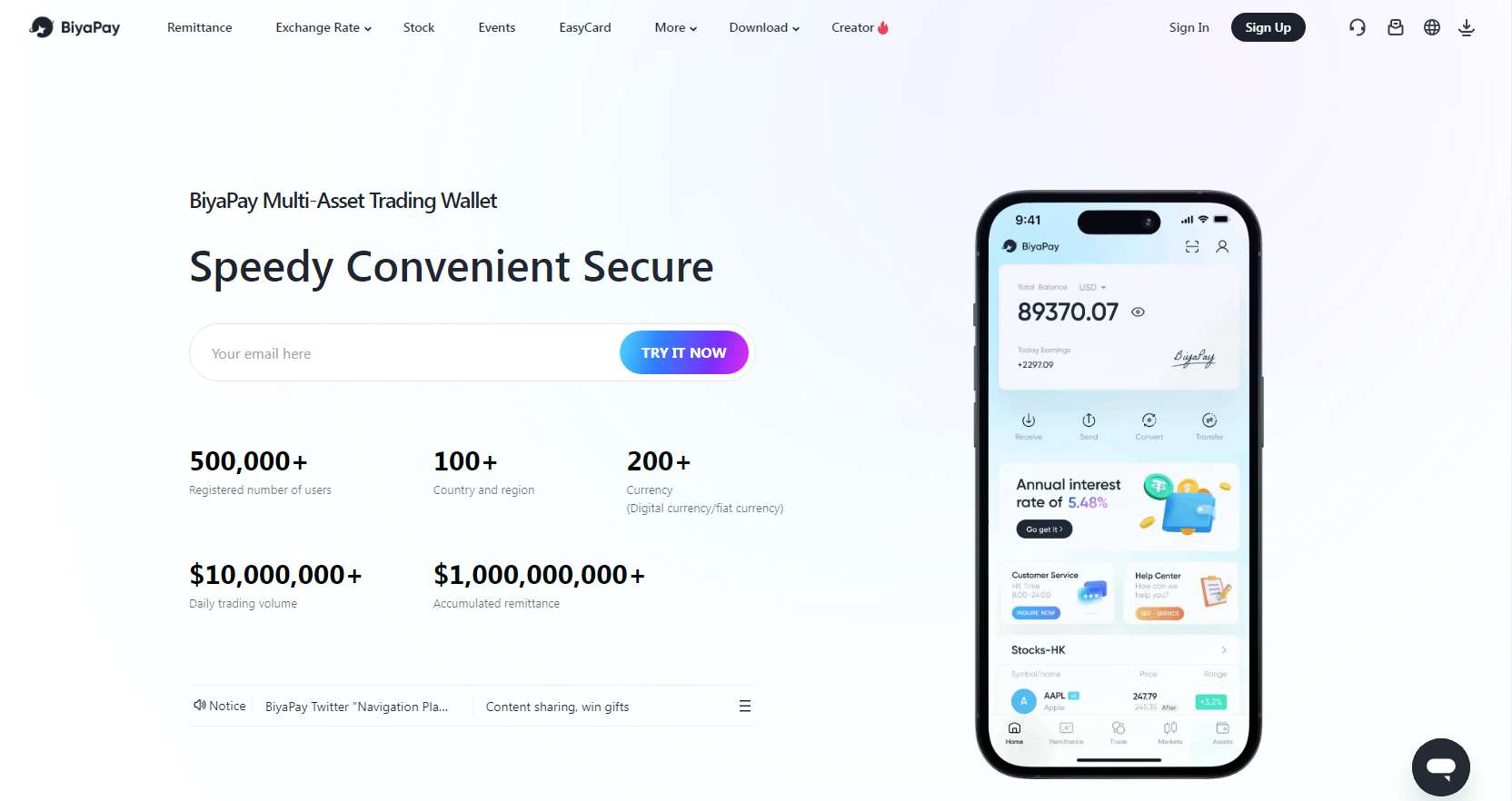
BiyaPay: leveraging market data for optimized financial operations
BiyaPay utilizes market data, including stock heat maps, to furnish users with insights into global market trends, thereby optimizing their financial management and decision-making processes. This integration ensures a data-driven approach to financial operations. BiyaPay incorporates real-time market data, such as live stock heat maps, to enhance business payment processing and international transactions. By providing a live view of market dynamics, BiyaPay enables businesses to make more informed transaction timings and currency exchange decisions.
Businesses can leverage BiyaPay’s market insights, derived from real-time data and sector performance visualized through tools like heat maps, to strategically adapt their financial strategies. This adaptability allows for timely responses to market changes and the identification of potential opportunities. Integrating BiyaPay into existing financial workflows offers a streamlined process to access and apply market data for improved payment processing and overall financial management. This ease of integration facilitates the seamless incorporation of market intelligence into business operations.
Key features of BiyaPay
- Global market trend insights: BiyaPay offers users insights into global market trends derived from market data, including stock heat maps. This empowers better financial management and decision-making.
- Real-time market data integration: The platform integrates real-time market data, such as live stock heat maps, to enhance business payment processing and international transactions, enabling more informed timing and currency management.
- Strategic financial adjustments: Businesses can utilize BiyaPay’s market insights, based on real-time data and sector performance, to strategically adjust their financial strategies in response to market changes and opportunities.
- Seamless workflow integration: BiyaPay is designed for easy integration into existing financial workflows, providing seamless access to market data for improved payment processing and overall financial management.
Steps to use BiyaPay for accessing stock market heat maps
Step 1: Download the BiyaPay app
Proceed to first download the BiyaPay app on your smartphone. The app is available for both Android and iOS devices.

Step 2: Register and verify your identity
Once downloaded and installed, launch the app and sign-up using your email address. After that, complete the identity verification process and fill out your user profile to activate all features securely.
Step 3: Navigate to the market section
After that, head over to the “Markets” section and then select the market or index you want to view as a heat map (e.g., S&P 500, Nasdaq, specific sectors).
Step 4: Analyse the market data (including stock heat map)
Finally, access the stock heat map from the navigation menu and then observe the colors and sizes of the boxes to quickly identify the overall market sentiment, sector performance, and individual stock performance. Additionally, you can access more detailed information, such as news and financial data, for a deeper analysis.
User Reviews
“I’ve been using it since the moment I went online, I’ve been using it all the time. It’s trustworthy.”
“The exchange rate is clear at a glance, and you can grasp the market in real time.”
“BiyaPay is the rocket fuel for my business!”
Other notable stock market heat map apps and tools
In addition to BiyaPay, you can also try out the below-mentioned popular stock market heat map apps and platforms for an enhanced experience.
1. TradingView
A widely used platform offering highly visual and customizable heat maps for stocks, forex, and cryptocurrencies across numerous global exchanges. Features include real-time data (for premium users), various grouping options (sector, market cap, etc.), and multiple filters.

Key Features:
- Advanced charting tools: Offers a wide array of chart types (including Renko, Kagi, Point & Figure), technical indicators (400+ built-in, 100K+ community-powered), and drawing tools (110+ smart tools) for in-depth analysis.
- Customizable watchlists and alerts: Users can create multiple watchlists (up to 25 in some paid plans, with 1000 symbols per list) and set up various types of alerts based on price movements, indicators, or drawings, with options for second-based alerts.
- Stock screener: A powerful screener with 100+ fundamental and technical fields, allowing users to filter stocks, ETFs, forex, crypto, and more across 150+ exchanges from over 50 countries.
- Paper trading: Provides a simulated trading environment, allowing users to practice trading strategies without risking real capital.
User Reviews:
“The charting capabilities on TradingView are phenomenal. It’s got every tool and indicator I could ever need, and the charts are so clean and customizable. Makes technical analysis a breeze!”
“I love the community aspect of TradingView. Being able to see other traders’ ideas and share my own has really helped me learn and improve my trading strategies.”
“The watchlist and alert system is super efficient. I can keep track of all my key stocks and get notified instantly when important price levels are hit. It saves me so much time.”
2. Finviz
Known for its user-friendly interface and free heat maps of the U.S. stock market and global indices. It provides sector breakdowns and, with the “Elite” subscription, offers real-time data and advanced charting tools.
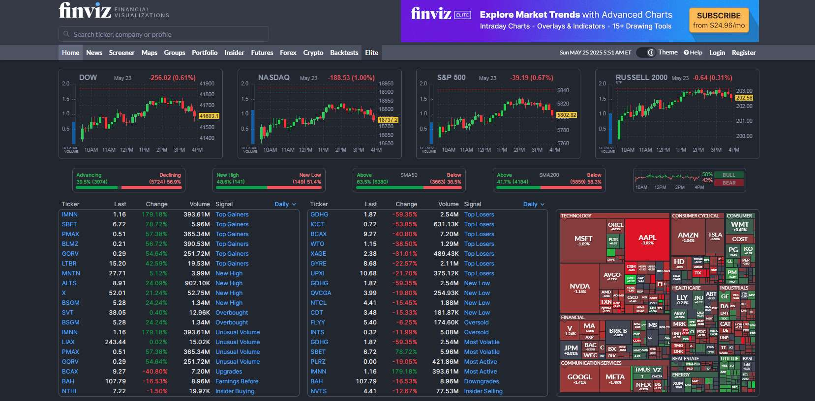
Key Features:
- Market heatmaps: Offers visual representations of the stock market, allowing users to quickly identify sectors and stocks with significant price changes.
- Insider trading data: Tracks the buying and selling activities of company executives, providing potential insights into company performance.
- Comprehensive financial data: Provides access to historical data, earnings reports, and key company financials for informed decision-making.
- Charting tools: Offers interactive charts with various technical indicators to visualize stock trends and patterns (advanced charting is typically a feature of the paid “Elite” version).
User Reviews:
“Finviz’s stock screener is incredibly powerful yet easy to use. I can filter stocks based on so many different criteria, both fundamental and technical, to find exactly what I’m looking for.”
“I really like the visual representation of the market through Finviz’s heatmaps. It gives me a quick overview of which sectors and stocks are moving the most.”
“The comprehensive financial data and insider trading information available on Finviz helps me get a well-rounded view of a company before making any investment decisions.”
3. MarketWatch
Offers a sector heat map that tracks the performance of the S&P 500 sector SPDR ETFs. Users can view performance over different timeframes (daily, weekly, monthly, YTD) and click on sectors to see component stock performance.
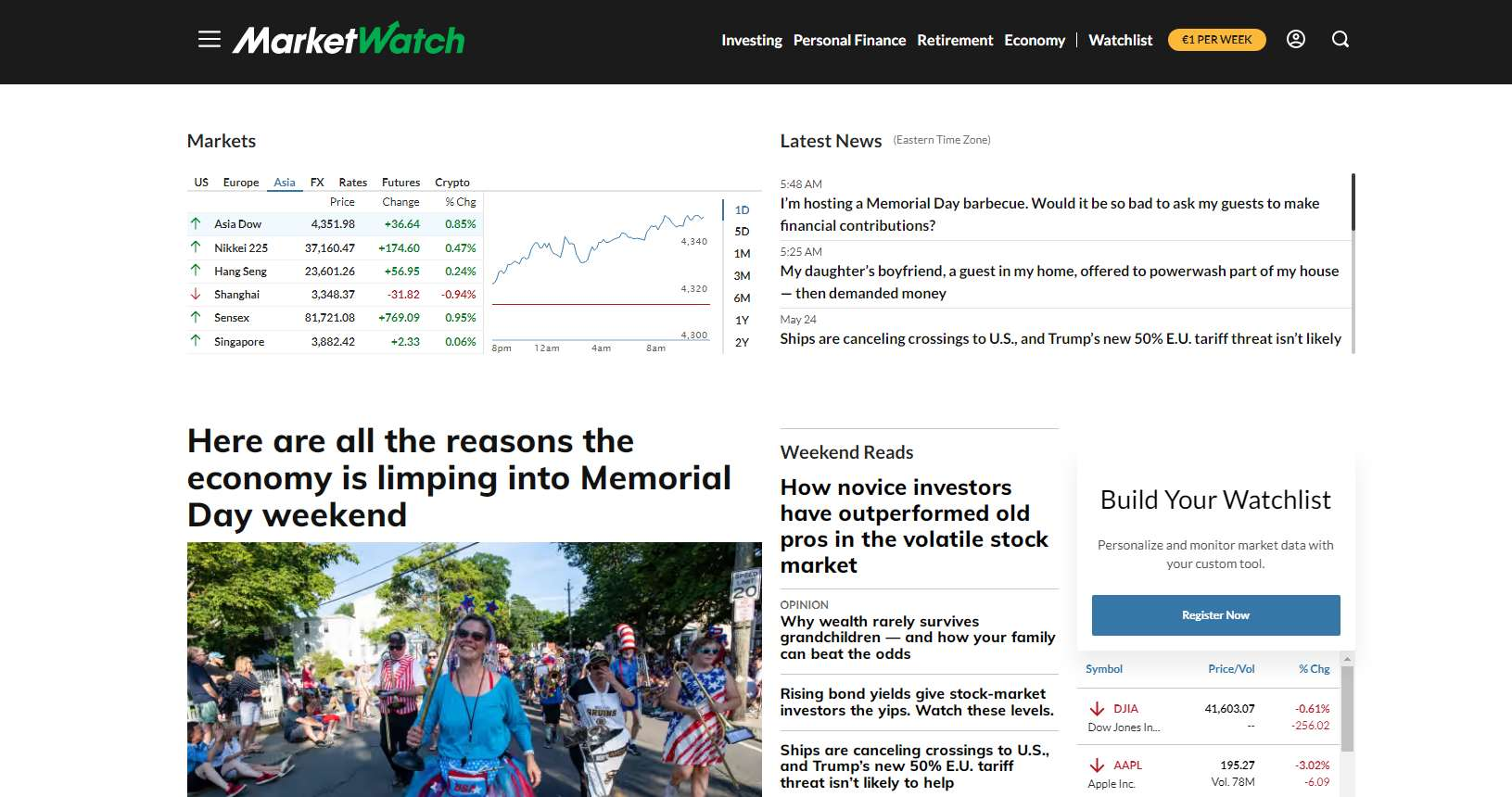
Key Features:
- Real-time market data: Provides up-to-the-minute data on stock prices, index movements, commodities, rates, and currencies across major global markets.
- Market-Moving Alerts: Offers the ability to receive alerts on mobile devices for significant market events.
- Business news & analysis: Delivers breaking news stories, videos, and in-depth analysis of the stock market, finance, business, investing, technology, and personal finance.
- Article sharing and saving: Users can save articles to read later and instantly share stories via social media, text message, and email.
User Reviews:
“MarketWatch is my go-to for staying updated on market news. The articles are insightful, and I appreciate the real-time data integration within the news stories.”
“I find the customizable watchlists on the MarketWatch app very useful for tracking my portfolio and related news on the go. It’s convenient to have everything in one place.”
“The ability to save and share articles is a great feature. I often come across interesting analysis that I want to read later or share with my friends who are also investors.”
Stock sector heat maps: visualizing sector performance
Stock sector heat maps are specialized visualizations that group individual stocks into their respective economic sectors, such as technology, energy, consumer goods, financials, healthcare, and industrials. Each block on the heat map represents a company within that sector, and its color-coding reflects the stock’s performance over a chosen timeframe.
These sector-specific heat maps offer valuable insights into which segments of the U.S. economy are currently experiencing strong growth or facing headwinds. By observing the dominant colors within each sector, investors can quickly identify prevailing trends. For instance, a sector heat map dominated by bright green in the technology sector suggests strong overall performance in that area, potentially driven by factors like innovation, high demand, or positive earnings reports. Conversely, a predominantly red energy sector heat map might indicate challenges such as declining oil prices or regulatory pressures.
The information gleaned from sector heat maps plays a crucial role in identifying potential investment opportunities and refining investment strategies. If a particular sector consistently shows strong performance (lots of green), investors might consider increasing their exposure to companies within that sector, aiming to capitalize on the upward trend. Conversely, if a sector consistently lags (lots of red), investors might consider reducing their holdings in that area or exploring opportunities in more resilient sectors. This top-down approach, starting with sector analysis, can help investors make more informed decisions about where to allocate their capital and adjust their portfolios to align with broader market trends and sector-specific dynamics within the U.S. economy.
How to use a stock heat map today
If you are planning to learn the trades as to how to use a stock heat map today, then following our comprehensive step-by-step guide below should be a great way to kick-start your journey.

1. Access a Live Stock Heat Map
- Choose a platform: Several financial websites and brokerage platforms offer live or near real-time stock heat maps. Popular options include Finviz, TradingView, MarketWatch, and many brokerage platforms like Fidelity or Charles Schwab. Navigate to their charting or market analysis sections. Look for tools labeled “Heat Map,” “Market Map,” or similar.
- Ensure real-time data (or as close as possible): Verify that the heat map is displaying current data or at least the data from the most recent trading session. Many platforms will indicate the last update time.
2. Analyze top-performing and bottom-performing sectors/stocks
- Sector overview: Begin by looking at the sector-based heat map (if available). Identify the sectors that are predominantly bright green – these are the top-performing sectors for the period displayed (likely the last trading day). Conversely, sectors showing mostly red are the underperforming ones.
- Drill down to individual stocks: Within the leading sectors, examine the individual stocks. The brightest green blocks represent the stocks with the largest gains. Similarly, the darkest red blocks indicate the biggest losers. Note down the names of these significant movers.
- Consider the context: Don’t just look at the colors in isolation. Think about any major news or events that occurred on the last trading day (Friday) or overnight that might be driving these movements. For example, were there significant earnings reports, economic data releases, or geopolitical events that could be impacting specific sectors or stocks? Financial news outlets like Bloomberg, Reuters, and the Wall Street Journal would be good resources for this context.
3. Make informed decisions based on real-time (or recent) market movements
- Short-term trading ideas (if markets were open): If you were observing a live heat map during an active trading day, strong momentum in individual stocks within leading sectors could present short-term trading opportunities. However, always consider your risk tolerance and use other technical analysis tools to confirm potential entry and exit points. Be cautious of chasing overly extended moves.
- Understanding market sentiment: Even looking at the heat map from the last trading day (Friday) provides insights into the prevailing market sentiment at the end of that session. A predominantly green map suggests a bullish sentiment, while a red map indicates bearishness. This can influence your outlook for the upcoming trading week.
- Identifying potential pullbacks or reversals: Notice if previously strong sectors are starting to show some red or less intense green, or if previously weak sectors are showing some signs of life (lighter red or even green). This could hint at potential pullbacks or reversals in trends.
Stock heat maps vs. Traditional charts: which one to use?
The choice between stock heat maps and traditional charts depends on your investment strategy and your need for real-time data:
- For a quick understanding of the day’s market movers and sector performance: Use a stock heat map. This is especially helpful for day traders or those looking for short-term trading opportunities based on immediate market sentiment.
- For in-depth analysis of a specific stock’s historical performance, identifying patterns, and forecasting potential price movements: Use traditional charts. This is crucial for swing traders, position traders, and long-term investors who rely on technical analysis.
- For identifying potential investment opportunities based on sector trends: Start with a sector heat map to see which areas of the market are showing strength, then use traditional charts to analyze individual stocks within those promising sectors.
- For monitoring your portfolio’s overall performance and identifying potential diversification issues: A customizable heat map of your holdings can provide a quick visual overview, while traditional charts of individual holdings can offer deeper insights into their performance drivers.
In many cases, the most effective approach is to use both tools in conjunction. Heat maps can help you quickly identify areas of interest in the market, and then you can use traditional charts to conduct more detailed analysis of specific stocks or sectors that stand out on the heat map.
Conclusion
In conclusion, stock heat maps stand out as powerful visual tools for navigating the complexities of the stock market. They offer an immediate and intuitive way to grasp market performance, quickly identify leading and lagging sectors or individual stocks, and spot emerging trends that might otherwise be buried in overwhelming amounts of data. By translating intricate financial information into a color-coded format, heat maps empower investors to make faster, more informed decisions, whether they are day trading, swing trading, or building long-term portfolios.
That’s why, we encourage you to explore and leverage the capabilities of platforms like BiyaPay, which provide access to real-time market data and tools for analyzing market trends. Whether you’re an individual investor seeking to optimize your personal portfolio or a business looking to enhance your financial operations, understanding and utilizing visual aids like stock heat maps can provide a significant edge in today’s dynamic financial landscape. By combining the broad overview offered by heat maps with the detailed analysis available through BiyaPay, you can gain a more holistic understanding of market forces and ultimately improve your investment outcomes and financial strategies.
FAQs:
- What does the color of a stock heat map represent?
The color on a stock heat map typically represents price changes (green for gains, red for losses), with intensity indicating magnitude. BiyaPay, focused on optimizing financial operations, understands the value of quickly visualizing market movements for informed decisions. - How do stock sector heat maps help investors?
Stock sector heat maps group stocks by industry, revealing strong (green) and weak (red) sectors for investment insights. BiyaPay’s emphasis on efficient financial analysis aligns with the rapid sector assessment offered by these maps. - Can I use stock heat maps for cryptocurrency investments?
While standard stock heat maps track equities, the concept can extend to cryptocurrencies on some platforms. BiyaPay’s forward-thinking approach to financial tools could potentially incorporate such visualizations for diverse asset classes. - Where can I find the best live stock heat maps?
High-quality live stock heat maps are found on major financial sites and brokerage platforms. BiyaPay users seeking to optimize their financial strategies can leverage these real-time visual insights for timely decisions. - Are stock heat maps only useful for experienced traders?
Stock heat maps are useful for all investors due to their intuitive visual representation of market trends. BiyaPay aims to empower all users with clear market understanding, making heat maps a valuable tool regardless of experience level.
*This article is provided for general information purposes and does not constitute legal, tax or other professional advice from BiyaPay or its subsidiaries and its affiliates, and it is not intended as a substitute for obtaining advice from a financial advisor or any other professional.
We make no representations, warranties or warranties, express or implied, as to the accuracy, completeness or timeliness of the contents of this publication.


Contact Us
Company and Team
BiyaPay Products
Customer Services


BIYA GLOBAL LLC is a licensed entity registered with the U.S. Securities and Exchange Commission (SEC No.: 802-127417); a certified member of the Financial Industry Regulatory Authority (FINRA) (Central Registration Depository CRD No.: 325027); regulated by the Financial Industry Regulatory Authority (FINRA) and the U.S. Securities and Exchange Commission (SEC).
BIYA GLOBAL LLC is registered with the Financial Crimes Enforcement Network (FinCEN), an agency under the U.S. Department of the Treasury, as a Money Services Business (MSB), with registration number 31000218637349, and regulated by the Financial Crimes Enforcement Network (FinCEN).
BIYA GLOBAL LIMITED is a registered Financial Service Provider (FSP) in New Zealand, with registration number FSP1007221, and is also a registered member of the Financial Services Complaints Limited (FSCL), an independent dispute resolution scheme in New Zealand.